Record Antarctic Temperatures in Feb. 2020 Impact on Eagle Island Ice Cap

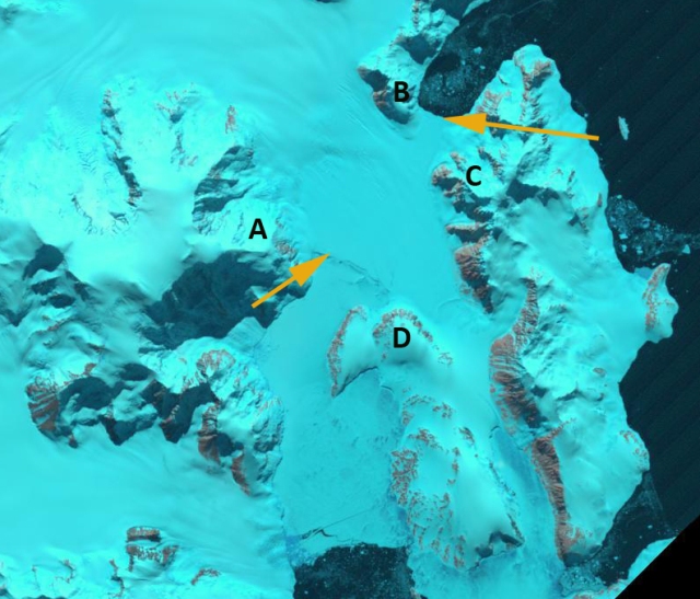
Eagle Island Ice Cap, Antarctica in Landsat images from Feb. 4, 2020 and Feb. 13, 2020.  Point E indicates an are area of snow/firn that is saturated with meltwater. Point A and B indicate locations where the amount of bare rock/ground and hence albedo have changed dramatically.
This post was source for an article by Kasha Patel published by NASA Earth Observatory
, CNN and Washington Post.

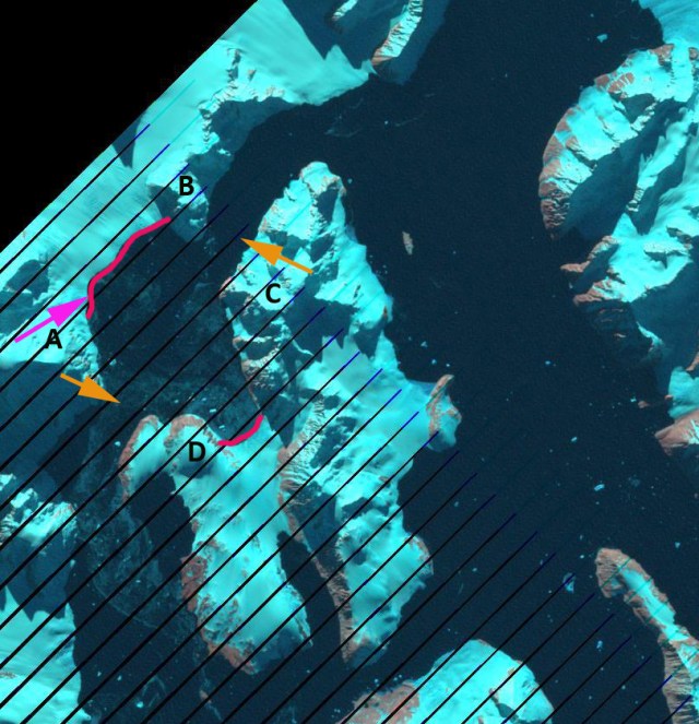
Update in December 2022 snowcover is less extensive than observed in 2020 or 2021.

The impact of period of record warm weather over the Antarctic Peninsula has been the rapid development of melt features on some of the glaciers near the tip of the Peninsula, where the temperature records were set at Esperenza and Marambio Base. Here we examine Landsat imagery of the Eagle Island Ice Cap (63.65 S 55.50W), 40 km from Esperanza, from January 12-February 13, 2020 to identify surface melt extent and surface melt feature development. Xavier Fettweis, University of Liege Belgium, using the MAR climate model output forced by the Global Forecast System (GFS) to generate daily melt maps for Antarctica, for Esperanza the melt map for recent weeks, shown below indicates that daily melt increased to above 30 mm/day, with a maximum temperature on the warmest day of 18.3 C (65 F). This compares to melt rates seen on the warmest days on temperate glaciers, such as the North Cascade Range, Washington of 80 mm/day and averaging 24 mm/day for the warmest months (Pelto, 2018).  This short term weather event fits into the pattern of overall regional warming that has led to a rapid glaciological response, with 87% of glaciers around the Antarctic Peninsula receding Davies et al (2012). The event regionally was examined by Robinson et al (2020),who noted implications for flora.

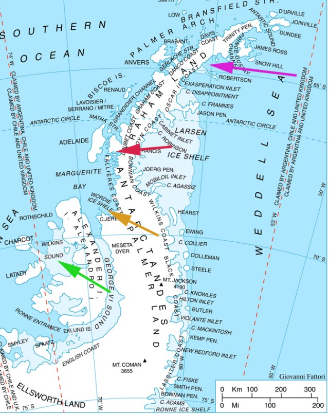
On January 12, 2020 Landsat imagery indicates a substantial area of bare ice/firn (gray-blue) on the western outlet glacier near Point A.  The brighter electric blue color indicates accumulated snow from the most recent winter season, this covers 60% of the ice cap.  The Jan. 27 image shows little change in the snowcover extent or the extent of older firn and ice exposed by melt.  The Feb. 4, 2020 image indicates a new snowfall has covered the ice cap. The precipitation graph provided by Xavier Fettweis indicates two snow events between Jan. 28 and Feb. 4 of approximately 5 mm water equivalent each.  The warm temperatures began on Feb 5 and continued up to the date of the Landsat image on Feb. 13. At Point E is a ~1.5 km2 area of cobalt blue that indicates snow/firn pack that is saturated with meltwater that has quickly developed.  There is an additional ring of saturated snow/firn northeast of Point E.  The snow swamp that has developed is due to the combination of melt, a total of 106 mm by Xavier’s model from Feb.6-Feb.11 and a rain event that occurred on Feb. 12 of ~6 mm. Peak melt reached 30 mm on Feb.6 similar to that at Esperanza. Point E is at the summit of the icecap between 250 and 300 m elevation. The area of bare ice (blue-gray) has expanded at Point A and Point B.  This higher albedo will enhance ablation in the near future before new snowfall covers the ice cap again.  The bedrock area near Point B has also expanded merging a couple of isolated bedrock knobs.

The impact of short term melt events like this on an ice cap like this, is visible and significant for annual mass balance, but not large in terms of long term glacier mass balance (volume change) and area.  The accumulation rate on nearby James Ross Island is ~600 mm/year.  Hence, this one melt event represents the loss of ~20% of the seasonal accumulation (Abram et al. 2011).  In Antarctica specific anomalously warm days are when most mass balance losses occur. Barrand et al (2013) note a strong positive and significant trend in melt conditions in the region.The increasing frequency and cumulative impact of events like this is significant to mass balance. Mass balance regionally has been negative driving retreat and ice shelf disintegration as noted at nearby Mondor Glacier, Muller Ice Shelf and Eyrie Bay.

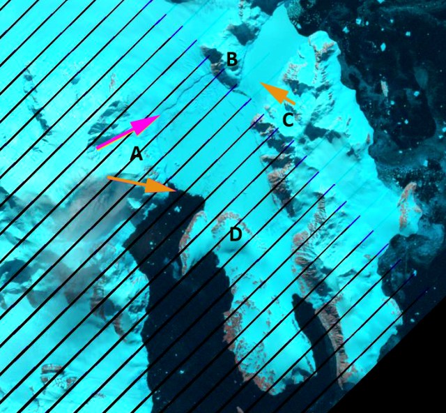
Eagle Island Ice Cap, Antarctica in Landsat images from Jan. 12, 2020 and Jan. 27, 2020.  Point E indicates the top of the ice cap and it is an area of snowcover. Point A is adjacent to outlet glacier that has bare ice exposed. Point B is above a fringing area of bare firn and ice at the southern margin of the ice cap and island.

Meltwater production time series at Esperanza Base from MAR-GFS From Xavier Fettweis

Meltwater production time series at Eagle Island from MAR-GFS From Xavier Fettweis

Precipitation time series at Eagle Island from MAR-GFS From Xavier Fettweis

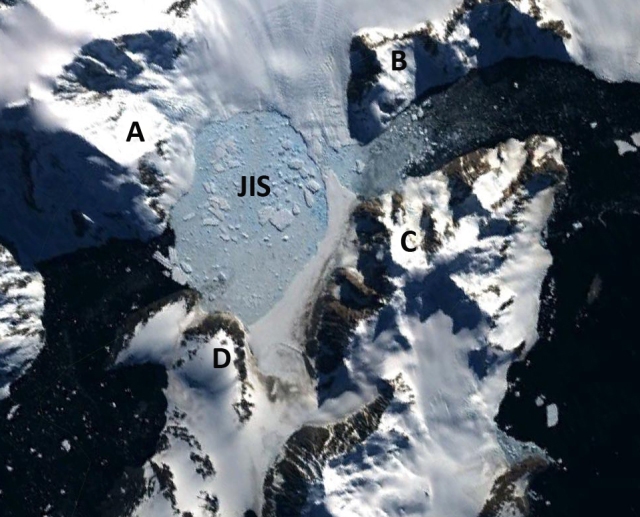
Eagle Island in Antarctica REMA viewer from Feb. 2017 indicating the snocovered ice cap with some melt area near the outlet glacier to the northwest and on the southern margin. the right hand image is the DEM of the area contoured in 25 m intervals With summit area of the ice cap above 250 m.

Eyrie Bay, Antarctic Peninsula Retreat 2000-2020

From REMA Landsat images from Feb. 2016 and Oct. 2019 indicating the front of the Cugnot Ice Piedmont (CP)  and Broad Valley (BV) ice fronts in Eyrie Bay.  Point A, B, and C indicate specific bedrock knobs near the ice front.  Point D is just south of a side glacier entering the bay.

Eyrie Bay is near the tip of the Antarctic Peninsula and is rimmed by tidewater glaciers including the Cugnot Ice Piedmont.  The changes of the ice front fed by the Cugnot and from Broad Valley were mapped by Ferrigno et al (2008)   They noted a retreat from 1956-1977 averaging 36 m/year from 1977-1988 a retreat of 12 m/year, and 6 m/year from 1988-2000. Here we examine Landsat imagery from 2000-2020 to identify changes of the two glacier fronts. The continued significant warming air temperatures on the Antarctic Peninsula have increased surface ablation in the region (Barrand et al 2013), with 87% of glaciers around the Antarctic Peninsula now receding Davies et al (2012) . The most dramatic response has been the collapse of several ice shelves, Jones, Prince Gustav, Wordie, Larsen A and Larsen B. The  nearby Prince Gustav Ice Shelf connecting James Ross Island to the Trinity Peninsula collapsed after 1995 (Glasser et al 2011).

In 2000  the Broad Valley terminus (BV) extended 500 m beyond bedrock knob at Point A and 1400 m eastward beyond the bedrock knobPoint B. The Cugnot Ice Piedmont terminus (CP) extended from the northern tip of the bedrock knob at Point C. In 2016 the BV terminus in Eyrie Bay was 600 m east of the Point A bedrock knob and 1200 m east of the Point B bedrock knob.  By October 2019 the BV ice front had retreated to the bedrock knob at Point B and terminated near the western end of the bedrock knob at Point A, with just a narrow band of fringing ice around Point A. At Point C a small embayment has developed along the west margin of the CP terminus and the embayment near Point D has become wider and move concave.

The surface slope upglacier of the BV terminus rises quickly indicating a rising bedrock topography too, which should slow retreat in the near future.  The CP terminus has a gradual even slope suggesting there will be continued retreat. The retreat of glaciers in this region has been attributed to both atmospheric warming in the region driving surface melt increases , and in some cases increasing ocean temperatures and ice shelf bottom melting (Barrand et al 2013; Davies et al 2014).

Landsat images from 2000 and 2020 indicating the front of the Cugnot Piedmont (CP)  and Broad Valley (BV) ice fronts in Eyrie Bay.  Point A, B, and C indicate specific bedrock knobs near the ice front.  Point D is just south of a side glacier entering the bay.

From REMA Antarctica contour of Broad Valley (BV) and  Cugnot Ice Piedmont (CP), contour interval is 25 m.

Cape Longing, Antarctica Transitioning to Island via Glacier Retreat

Cape Longing, Antarctica in 2001 and 2018 Landsat images. Point A-G are at specific locations. Yellow dots mark the margin of the glacier connecting the Cape to the main Antarctic Peninsula.

Cape Longing is on the Antarctic Peninsula between Larsen Inlet and Prince Gustav Channel.  Larsen Inlet along the south shore of Cape Longing was covered by the Larsen A Ice Shelf until its collapse in 1995. The Prince Gustav Ice Shelf extended across the channel from the north shore of Cape Longing until the 1980’s.  This 1600 square kilometer ice shelf disintegrated in the mid-1990’s and was gone by 1995 (Cook and Vaughan, 2010).   Here we examine changes in the glacier connecting Cape Longing to the Antarctic Peninsula from 2000 to 2018 using Landsat imagery.

In 2000 the glacier connecting Cape Longing with the main peninsula extended along a front from Point F to Point E. Northeast of Point G there is an area of rifted ice indicative of ice that had been grounded going afloat. On the southern margin the ice front extends southwest from Point A.  The glacier from the northern to the southern margin is ~9 km across.  In 2001 the southern margin has not changed, but the northern margin indicates an expanded ice melange between the active glacier and the ice front, making the exact terminus difficult to pinpoint.  By 2017 the northern ice margin has retreated to a line between Point B and Point G.  The southern margin extends west from Point A.  In 2018 it is 3.5 km from the northern to southern margin, more than 60% of this glacier connection to Cape Longing has been lost since 2000.  This connection appears to have a below sea level bed though the glacier is grounded.  This grounding should lead to a slower retreat. The ice shelf/glacier retreat at Cape Longing is significant though much less than the more dynamic nearby Sjogren Glacier.

View of Cape Longing in REMA Antarctic Explorer, which is the 2000 Landsat image.

Cape Longing, Antarctica in 2000 and 2017 Landsat images. Point A-G are at specific locations. Yellow dots mark the margin of the glacier connecting the Cape to the main Antarctic Peninsula.


Jones Ice Shelf Loss, Antarctica

The Jones Ice Shelf was midway up the west coast of the Antarctic Peninsula. The ice shelf (red arrow) was smaller than other ice shelves that have mostly or substantially disintegrated Wordie Ice Shelf (orange arrow), Larsen B Ice Shelf (pink arrow) or Wilkins Ice Shelf (green arrow). Ant-pen_mapThe British Antarctic Survey (BAS), has been observing the changes in ice shelves around the Peninsula Cook and Vaughan, (2010) and Fox and Vaughan (2005). The BAS noted that the ice shelf had an area of 29 square kilometers in 1980, by 1990 21 square kilometers and 10 square kilometers in 2000 and 2003, gone. Blaicklock Island (C and D) and the Arrowsmith Peninsula (A and B) are now separated by open water in Jones Channel. Cook and Vaughan (2010) also note that this was not the result of a long ongoing retreat, the Jones Ice Shelf expanded 20 % between 1947 and 1978. In the post below there is a sequence of images from Landsat and Google Earth imagery in a sequence as follows, 1989, 1991, 1999, 2009 and 2011. The Ice shelf exists in 1989 and 1991, ending at the orange arrows, which are included in the 2009 and 2011 images as well for comparison. Points A-D are in the same location in each image. The 1999 image indicates a disintegrating Jones Ice Shelf (JIS), with a small ice tongue protruding part way across Jones Sound, the new waterway that has opened. By 2009 the glacier has retreated out of the Jones Channel to the pink arrow and red line in 2011. The eastern terminus retreated 4 km and the western terminus 7 km. The ice shelf loss here is similar in magnitude to Rohss Bay on James Ross Island. jones 1989jones 1991jones tongue gejones 2009jones 2011

Fleming Glacier Acceleration and Retreat, Antarctica

Recent observations indicate that the Fleming Glacier on the Antarctic Peninsula which used to feed the Wordie Ice Shelf is accelerating and thinning even faster(Wendt et al, 2010) This is leading to the production of numerous tabular icebergs from the glacier front as seen below from a 2009 Google Earth image. . A is a rift that is also the ice front toward the upper right. B and C are rifts that will produce future tabular ice bergs. D is an iceberg with an area of just under 1 square kilometer. Wordie Ice Shelf was the northernmost large Ice shelf on the western AP. The ice shelf disintegrated between 1970 and 2000. From an area of 1900 km2 in 1970 to 100 km2 in 2009 as mapped by the British Antarctic Survey. The first image is from the BAS in 1989. Followed by a series of maps illustrating its demise put together by the BAS and USGS The breakup was suggested to have occurred due to a warming trend in the region that began in the 1970’s generating meltwater . There is also thinning and weakening around some of the pinning points where the ice shelf was grounded. This is similar to observations from Wilkins Ice Shelf.
The Wordie Ice Shelf was fed by several major tributary glaciers including the Fleming Glacier.
(Rignot and others (2005) used satellite radar interferometry to observe changes in behavior of Fleming Glacier from 1995 to 2004 identifying a 40-50% increase in glacier velocity from the terminus to 50 km above the terminus and a two meter per year thinning. More recent Airborne thickness data indicate thinning has increased to 3 or 4 m per year in the lower reach of the glacier during the 2004-2008 period (Wendt et al, 2010). Rignot and other (2005) further observed that 6.8 ± 0.3 km3/yr of ice, which is much larger than snow accumulation of 3.7 ± 0.8 km3/yr. This imbalance has certainly increased with acceleration.
Without the presence of a thick, slow moving ice shelf buttressing the Fleming Glacier it has accelerated. Below is a map from Wendt et al (2010) showing the Fleming Glacier former margins. Below that is Google Earth Image showing the nature of the calving front. Notice the tabular ice bergs that have and are about to break off. Below that is an image further up glacier, a nunatak has appeared in mid glacier that is not evident in the 1989 image. As observed for the Jakobshavn and Pine Island Glacier thinning leads to reduced buttressing and increased glacier flow.